 Vitalii Holben
What Competitor Pages to Monitor and How Often to Take Screenshots
Most companies understand that keeping an eye on competitors is important, but in practice the process looks nothing like what anyone imagines. Once a month (maybe once a quarter) someone opens a competitor's website, scrolls through the homepage, glances at a few other pages, decides nothing has really changed, and closes the tab. Then that same competitor launches a new feature, changes their pricing, or reworks their positioning entirely, and we find out about it last. Not because we weren't paying attention, but because we were paying attention to the wrong things at the wrong intervals.
The real issue isn't motivation. It's that nobody sits down to answer two specific questions: which pages on a competitor's site actually carry strategic signals, and how often do those pages change? Tracking every single page is unrealistic. But ignoring competitors until a surprise hits is worse. In this article we'll go through the specific page types worth monitoring, recommend a capture frequency for each one, and show how the whole thing can run on autopilot once you've set it up, so you spend five minutes configuring and then forget about it until something actually moves.
Start with five competitors. Trying to watch everyone is a trap
The first mistake is trying to monitor everyone. You might have 20 competitors in your space, but only 3 to 5 of them actually affect your day-to-day business. These are the companies targeting the same audience, competing for the same deals, operating in the same price range, and showing up in the same search results. The rest are background noise: interesting to know about, but not worth a monitoring slot.
We recommend picking five competitors and identifying 5 to 10 pages on each site. That gives you roughly 25 to 50 URLs total, which is a perfectly manageable volume for automated monitoring. More importantly, it keeps you focused on changes that matter rather than drowning in alerts about sites that don't affect your revenue.
The pricing page is the single most valuable page to track
If you can only monitor one page on a competitor's site, make it the pricing page. Price changes are a direct signal of strategic decisions, not marketing fluff, not copywriting experiments, but real choices about how the business makes money. When a competitor raises prices, it usually means they feel confident about growth and aren't worried about losing customers over a bump. When they drop prices, the picture is different. they may be fighting for market share or dealing with churn they haven't talked about publicly.
But pricing pages carry more information than just the dollar amounts. Plan structure tells its own story: if they had three plans and now there are four, that's worth noticing. An enterprise tier with a "contact us" label instead of a price signals a move toward larger customers. Feature gating is another signal: when capabilities get moved from cheaper plans to more expensive ones, it reveals where the company's priorities are shifting. Even the presentation matters: switching to "Starting at /mo" instead of showing exact figures, or making annual billing the default, usually reflects a deliberate A/B test result or a strategic decision about how they want to frame value.
We covered the full methodology for tracking SaaS pricing in our guide to automated pricing page monitoring, including what visual diff catches that text-based tools miss, like promotional banners and layout changes that reframe the pricing message without changing the numbers themselves.
Recommended frequency: once a week. Prices don't change every day, but missing a change for two weeks means losing time to react and failing to update your own positioning while it still matters.
The homepage is a mirror of how the company wants to be perceived
Every change on a homepage is a deliberate choice, nobody accidentally rewrites their hero section. A new headline means they've shifted their messaging. Replacing client logos with case studies means they're switching from social proof to proof-of-value. Adding a "Book a demo" button next to "Get started" means they're opening a sales-led funnel alongside self-service. We caught exactly this kind of change on Paddle recently. a single new button in the navigation, 5% visual diff, but a clear go-to-market signal buried in what looked like a minor tweak. That example is in our article on real website changes we caught with screenshots.
On the homepage, pay attention to three areas in particular. The hero section (headline, subheadline, CTA), when a competitor changes their main headline, it means someone spent time finding a better way to phrase what the company does. Social proof elements. client logos, numbers like "10,000+ teams", testimonials. If a big logo appears for the first time, it usually means a major deal just closed. And the navigation bar: new menu items often signal the launch of new products or entire new verticals.
Recommended frequency: once a week. Homepages don't get updated daily, but when they do, the changes are almost always significant enough to warrant attention.
Changelogs and feature pages reveal what the dev team is working on
If a competitor maintains a public changelog or a "What's New" page, it's one of the most honest sources of competitive intelligence you'll find. You can literally see what their development team shipped, in what order, and which features they considered important enough to announce publicly. A changelog that gets updated every week tells you the company has a regular release cycle and enough resources to maintain it. A changelog that goes quiet for two months tells a different story.
The features page (/features or /product) changes less often, but when it does, the update is usually substantial, new integrations, new capabilities, or a complete rethink of how the product is organized and presented. These pages tend to get rewritten during positioning shifts, so a change here often coincides with or foreshadows pricing and homepage changes.
Recommended frequency: check the changelog about twice a week, the features page once every two weeks.
The blog reveals their SEO strategy and content direction
A competitor's blog tells you two things at once: what topics they're betting on (which is their SEO strategy made visible) and how they talk to their audience. The pain points they're highlighting, the tone they're using, the customer segments they're writing for.
You don't need to monitor every individual post. It's enough to track the main blog page (/blog) and see what new posts appear, how often they're publishing, and whether the topics are shifting. A competitor that suddenly starts publishing three articles a week instead of one has either hired a content team or is compensating for a traffic drop. If their topics shift from how-to guides to case studies, they're moving from attracting traffic to converting it. A sign that they've entered a different growth phase.
Recommended frequency: once a week.
Career pages reveal strategic direction before press releases do
Job listings are an underrated source of competitive intelligence, and they deserve a spot in every monitoring setup. If a competitor is hiring five ML engineers, that tells a very different story than if they're looking for three enterprise sales reps. Five open positions for "Solutions Engineer" and "Customer Success Manager" means they're building out an enterprise motion. A "Head of Partnerships" listing signals a channel strategy is coming. Open positions reveal strategic direction earlier than any blog post or press release, because companies start hiring for a direction before they announce it.
Monitor /careers or /jobs. Screenshots are especially useful here because job listings appear and disappear, and without an archive you won't notice the pattern: a role posted for two weeks and then removed looks identical to a role that was never posted at all, unless you have the screenshot history to prove it existed.
Recommended frequency: once every two weeks. Job postings don't update hourly, and a two-week interval is sufficient to track hiring trends over time.
Landing pages show what marketing messages are being tested right now
If you know a competitor is running ad campaigns, it's worth monitoring their landing pages. These pages show which messages and offers are being tested to attract customers, the headline variants, the CTA wording, the social proof they're highlighting. Landing pages change frequently because they're the output of active A/B testing, which means every capture is a snapshot of a live experiment.
The tricky part is that landing pages often live on subdomains or at unpredictable URLs. But if you've found them (through ad libraries, SpyFu, or just clicking on their ads), add them to your monitoring list. For landing pages, we recommend using viewport mode instead of full-page capture. The hero section is what matters, and viewport keeps the screenshots focused and the storage light.
Recommended frequency: daily, as long as the campaign is active.
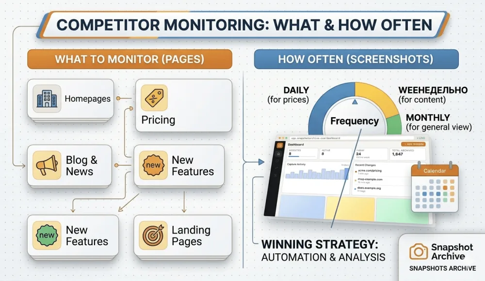
Summary: page types, frequencies, and what each one tells you
| Page Type | Example URL | Frequency | Why It Matters |
|---|---|---|---|
| Pricing | /pricing | Once a week | Direct signal of strategy and monetization |
| Homepage | / | Once a week | Positioning, messaging, and go-to-market shifts |
| Changelog | /changelog, /whats-new | Twice a week | Product development pace and priorities |
| Features | /features, /product | Every 2 weeks | Major updates and product restructuring |
| Blog | /blog | Once a week | SEO strategy and content direction |
| Careers | /careers, /jobs | Every 2 weeks | Strategic direction and team composition |
| Landing pages | Various | Daily | Active marketing campaigns and A/B tests |
For 5 competitors with 7 to 8 pages each, that's roughly 35 to 40 URLs. At an average frequency of once per week, you're looking at about 150 to 200 screenshots per month: a perfectly manageable volume for an automated tool, and a volume that would take someone several hours per week to handle manually.
Why manual monitoring falls apart after the first week
You could try doing all of this by hand. Open each page, take a screenshot, save it in a folder with today's date. That approach works for a week, maybe two. Then you forget, skip a day, lose the thread, and by the time you pick it back up, you've missed exactly the change that mattered. We wrote about this pattern in detail in our comparison of manual vs automated screenshots, and the conclusion was always the same: manual works for one-off checks, not for ongoing monitoring.
The problem isn't laziness, it's scale. Checking 40 URLs once a week means 40 tabs, 40 screenshots, 40 files to name and organize. And that's assuming you only have 5 competitors. On top of that, you still need to compare each new screenshot with the previous one to actually spot what changed. a task that's tedious enough when you're looking at 5 images and functionally impossible when you're looking at 40.
An automated screenshot tool solves the entire chain. You set up your URLs and schedule once, the system captures pages on autopilot, and visual diff highlights exactly what's different between any two captures. No squinting at side-by-side windows, no hoping your eyes catch a one-word change on a long page. If a competitor raises a price from $29 to $39, the diff overlay marks it in red. If they add a new navigation item, it shows up. If nothing changed, you don't hear about it, which is the whole point.
What to do with the data once you have it
Screenshots on their own are just images. The real value comes when you start reading the patterns that emerge over weeks and months of data.
A competitor that changed their pricing page three times in a single quarter is likely testing their monetization model, probably because the current one isn't performing well enough. If their homepage shifted from "for developers" to "for teams," they're moving upmarket and chasing larger accounts. A changelog that gets updated every week consistently points to a well-funded team with a regular release cycle, while one that goes quiet for six weeks might signal a pivot, a reorg, or a resource crunch. And when positions like "Head of Partnerships" and "Enterprise Account Executive" show up on a careers page, the company is building an outbound sales motion. which means their pricing and packaging will probably shift in that direction within a few months.
Once a month, it's worth spending 30 minutes going through your screenshot archive and noting what moved. This won't replace a full competitive analysis, but it gives you a steady stream of signals between those quarterly deep-dives, the kind of signals that help you update a battlecard the same week a competitor changes their positioning, not three months later when a prospect brings it up in a sales call.
If a change is large enough to act on immediately (a price increase, a new plan tier, a redesign) you'll know about it from the alert notification that Snapshot Archive sends when visual diff crosses your threshold. For smaller patterns that only make sense in aggregate, the monthly review is where the insight lives.
Snapshot Archive captures screenshots of any web page on a schedule and highlights visual differences between snapshots. Set up competitor monitoring in 5 minutes, no code, no manual work. Try it free →
Start archiving websites today
Free plan includes 3 websites with daily captures. No credit card required.
Create free account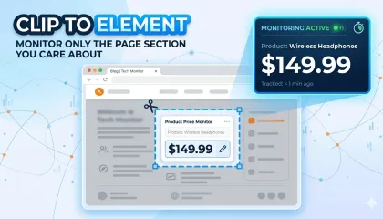
Clip to element: monitor only the page section you care about
Full-page screenshots on e-commerce sites catch too much noise. Clip to element lets you capture only the block you care about — for cleaner diffs and fewer false alerts.

When layout shifts break your price monitoring: a real Amazon tracking story
We set up price monitoring on an Amazon product page and immediately started getting 22% diff alerts — not because the price changed, but because a promotional banner kept appearing and disappearing in the navigation, shifting the entire layout down by a few dozen pixels. Here's how we figured out what was happening and what we'd recommend doing about it.
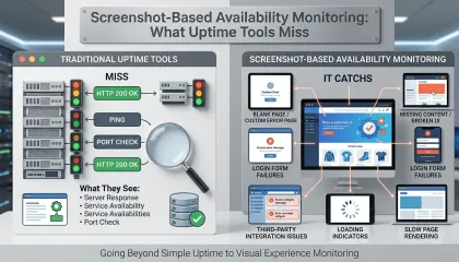
7% of Amazon Pages Returned Errors With HTTP 200. Here's the Proof.
We added a handful of Amazon pages to track product prices. Instead of price changes, we started getting alerts about error pages. Turns out scheduled screenshots double as availability monitoring, and they catch things Pingdom never will.